
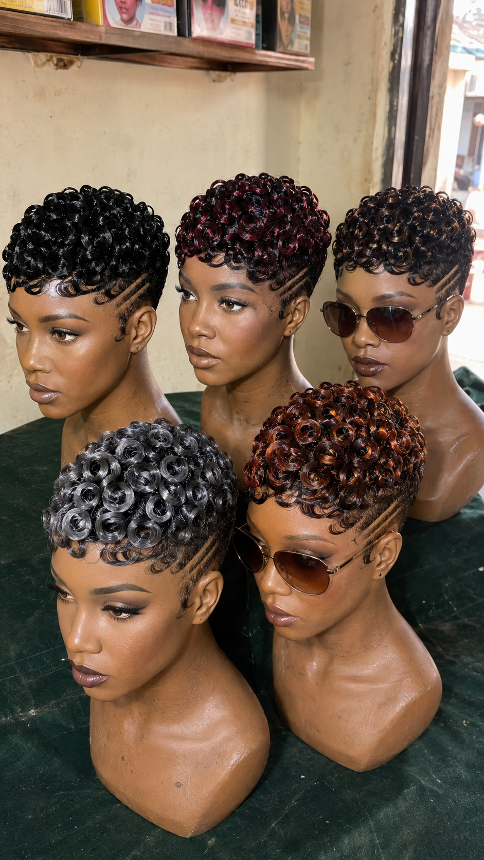
Look at the same black pixie on five different head shapes and face proportions, and notice how the color sits completely differently on each one. Black on a rounder face reads heavier, anchoring the cheeks. Black on an angular face reads sharper, adding definition. Black on a narrower profile carves the jawline. The color itself did not change — the face underneath did.
This is five displays wearing identical curly pixies with carved temple lines, each in a distinct color, each with a distinctly different face shape built into the mannequin. What this shows is that color choice is not separate from face-shape choice — they are the same decision.
How Each Tone Interacts With Face Geometry
Black (left) is neutral-to-cool and visually recessive on rounder faces, making them read smaller. On angular faces it adds sharpness, making cheekbones read more defined. Burgundy/wine (top center) is warm and advances toward the viewer, making it read closer and more present — it suits broader, rounder faces by framing them rather than compressing them.
Ash (bottom left) is cool and visually pulls back, which can elongate a round face but flatten an already long one. Copper (bottom right) is warm and catches light, which adds vibrancy to warm undertones but can wash out cool undertones. The bronze-toned unit (top right) splits the difference — warm enough to glow, cool enough not to overwhelm.
Color Weight and Visual Proportion
Heavier, darker tones (black, burgundy, bronze) carry visual weight, which means they can make a rounder or broader face read slightly smaller by “grounding” the silhouette. Lighter tones (ash, grey) distribute weight more evenly, which can make a face read taller or narrower. This is not about which color is “better” — it is about which color does what work for which face.
If you have a very round face and want to emphasize width and presence, burgundy or warm bronze reads better than black. If you want to create visual lift or elongation, ash reads more effectively. If you want neutrality, black does the grounding without warmth or cool overtones to interfere.
The Carved Temple Lines In Context
Every unit here carries the same carved design lines at the temple, which reads as an intentional design choice rather than a random styling detail. That consistency makes the color differences stand out more sharply — you are not comparing “carved vs. not carved,” just pure color impact.
The temple lines also carve out visual space, which changes how color sits. A darker tone with carved definition can read editorial and sharp; the same dark tone without those lines reads flatter and softer.
Recognizing Your Own Face Shape In The Lineup
Round faces tend to benefit from:
- Warm tones that frame (burgundy, warm bronze)
- Colors that add presence rather than compress
- Carved definition to create visual structure
Angular/long faces benefit from:
- Cooler tones that soften sharpness (ash, cool grey)
- Colors that add softness rather than definition
- Highlights or warm accents to balance angularity
Oval/balanced faces can wear almost any tone effectively — the advantage of starting with a neutral base.
How Carved Details Change With Color
The temple lines carved into every unit in this lineup sit differently depending on the color underneath. On black, they read as high-contrast graphic elements, almost tattoo-like in definition. On burgundy, they soften slightly, the carved path blending with the warmth of the tone. On ash, they read coolly sculptural. On copper, they almost disappear into the warm undertone unless lit from a specific angle.
This matters if carved details are the reason you want a unit — the design impact changes based on color choice. If you want the carved lines to be a major visual statement, darker tones make them read sharper. If you want them as a subtle detail, lighter or warmer tones subdue them without removing the design.
Before You Pay
- Does this pixie cut suit your face shape, apart from color?
- Which color in this lineup looks most flattering to you, and why?
- Does that color match your skin undertone, or does it contrast intentionally?
- Are you buying for everyday wear or a specific mood or occasion?
Search Terms
pixie wig face shape color · black pixie round face · ash pixie angular face · burgundy pixie frame · color selection pixie wig · face shape wig tone matching · curly pixie color choice · profile pixie wig color
Final Thoughts
Five identical pixies, five entirely different effects. The color is not independent of the face underneath — it is part of the same equation. Understanding how your face shape and the color interact tells you which wig is actually “yours,” not just which one photographs well on a generic mannequin.
If you are shopping by color alone, you are missing half the picture. Approach it as a simultaneous choice: which color, AND which face-shape interaction does that color create? That second question is what separates a unit that flatters you from one that flatters the mannequin.